COVID-19 Visualization Application Includes New Ways to View Data for Cases in the U.S.
It is no surprise that there is such a high volume of data relating to the recent COVID-19 outbreak. Kitware’s open source COVID-19 visualization app features high-performance geospatial visualization to organize and display this data in such a way that it can be easily analyzed by doctors, researchers, and even the public.
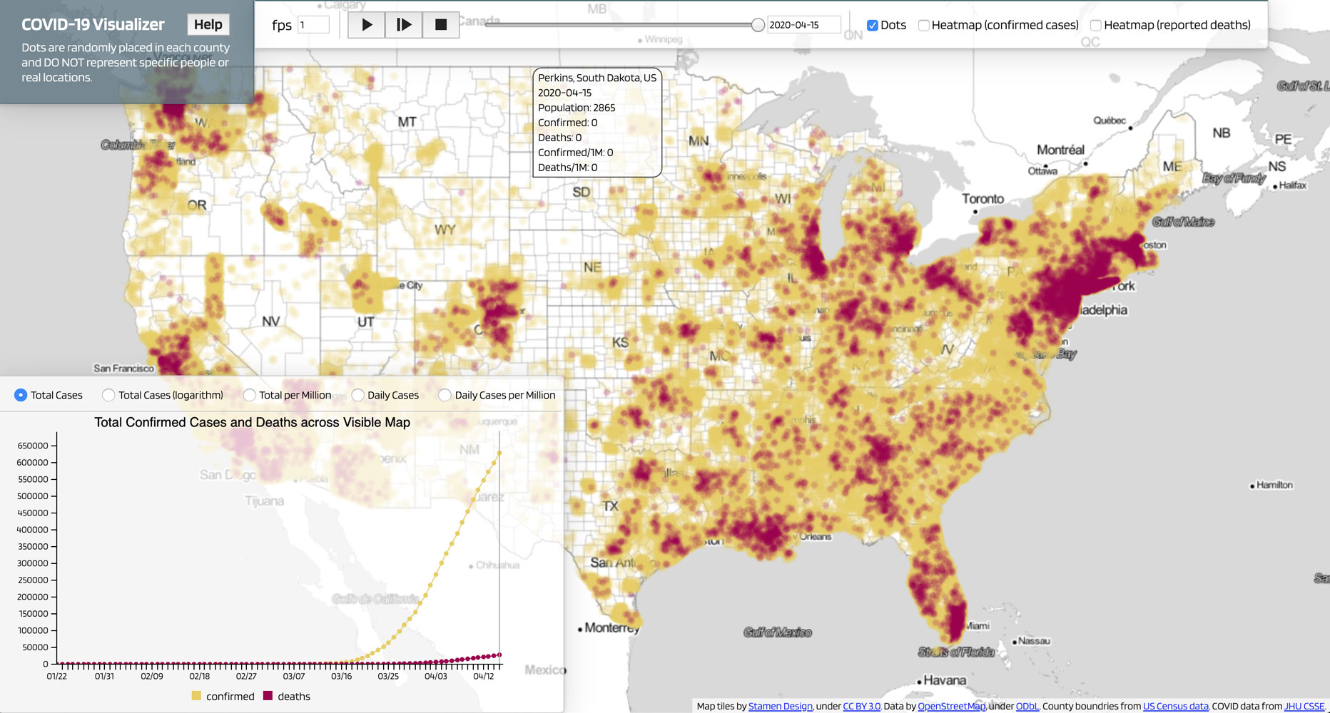
The COVID-19 vis app features a map that focuses on COVID-19 cases within the U.S. This map shows confirmed cases and reported deaths animated over time and has an associated chart that provides a graphical representation of those same numbers (see Figure 1). It is interesting to note that if you change the chart to display “total cases (logarithmic),” you can see the yellow line tapering off towards a plateau, indicating that the infection rate has been slowing down.
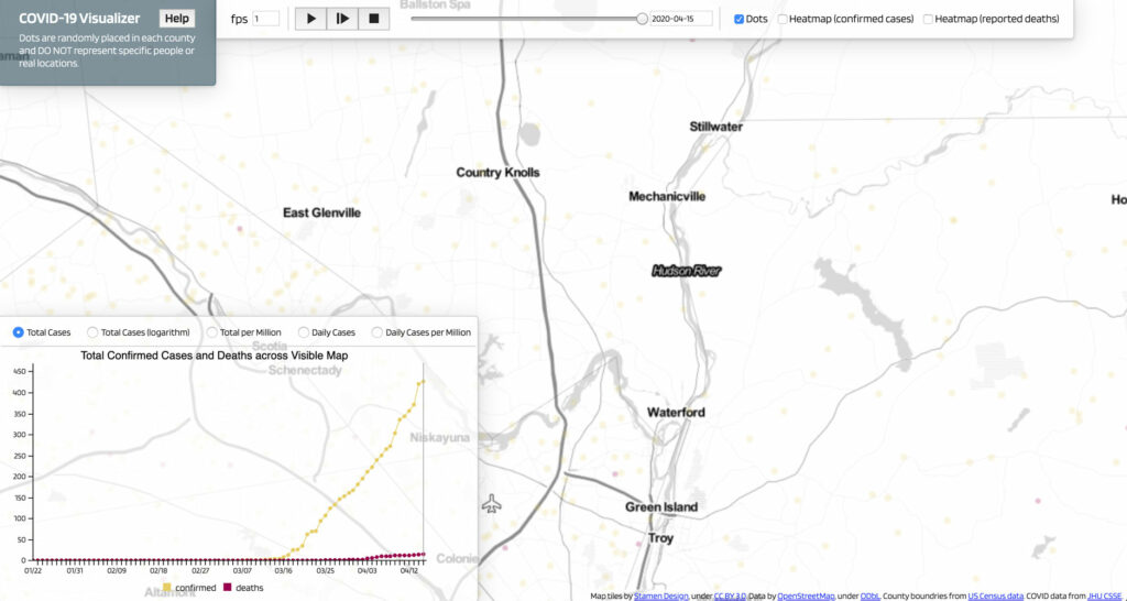
One of the benefits of using this app is that it gives users the ability to visualize every confirmed case and reported death within the U.S. interactively. Having reliable interactive performance from such a large scale of data is a result of Kitware’s mapping software, GeoJS, an open source high-performance mapping/visualization toolkit. Another unique feature of this app is that the map and chart visually represent each case as a single geospatial marker (Note: These markers are placed randomly within county boundaries, and do not represent actual locations or specific people). So as you pan and zoom around the map, the chart automatically filters the data to represent cases and deaths that have been reported only within the area of the map you’re looking at (see Figure 2).
You can use the features of this map to check out a few important pandemic milestones:
- Seattle, one of the first areas to have COVID-19 in the U.S. Based on the daily rate, you can see the peak daily cases occurred in late March and the first week of April.
- New York City, currently the biggest regional outbreak in the country.
- New Orleans, which also had its own aggressive outbreak.
How has COVID-19 affected your own area?
Kitware’s COVID-19 visualization app was developed by our Data and Analytics Team. The web-based application can be accessed here: https://kitware.github.io/covid-19-vis and the codebase can be cloned from GitHub: https://github.com/kitware/covid-19-vis. If you have questions about this application, please share them on our discourse forum. If you would like to learn more about the capabilities of our Data and Analytics Team, please email us at kitware@kitware.com or visit our website.
A nice representation, here is one for my state in Australia: NSW COVID-19 Cases and Community Profile by The University of Sydney
A nice visualisation. Here is one for Australia Charting the COVID-19 spread in Australia, this is updated daily.