Analyzing complex features in ensemble data with the Topology ToolKit in ParaView
Kitware note: This is a guest blog from Julien Tierny, from Sorbonne Université, Paris, France and Fabien Vivodtzev from CEA, France
The Topology ToolKit (TTK)[1,2] is an open source library for Topological Data Analysis and Visualization. It provides a substantial collection of generic, efficient and robust implementations of key algorithms in topological data analysis. It is available for several APIs (C++, VTK/C++, VTK/Python, ParaView/Python) and an online database of examples is available.
Since ParaView 5.10, TTK is officially integrated in ParaView in the form of a plugin.
In this post, we illustrate how Topological Data Analysis and TTK can help for the representation, comparison and statistical analysis of subtle features in ensemble data. Specifically, we focus on the Kelvin Helmholtz instability example, which we describe in detail here. After reading this post, you’ll be able to:
- Extract the main structural features in a dataset
- Compare two datasets based on their structural features
- Perform some unsupervised classification of a collection of datasets based on their structural features
- Interactively explore, with a concise 2D layout, a collection of datasets, based on their structural features

Figure 1: Ensemble dataset (left) consisting of 32 members modeling a 2D periodic flow subject to the Kelvin Helmholtz instability. This ensemble is divided into two groups: the “turbulent” datasets (top left) and the “non-turbulent” datasets (bottom left). A zoom on two “turbulent” datasets (center and right) shows two drastically different images (pixelwise) due to the chaotic nature of the turbulence.
Data
The data we consider in this example is a collection of 32 datasets describing a 2D flow subject to a phenomenon called the Kelvin Helmholtz instability (with periodic conditions). As shown in Figure 1, this collection of datasets is organized according to the following ground-truth classification:
- 16 datasets are labeled as “Turbulent”. These datasets correspond to timesteps at the end of the flow simulation, where the turbulent pattern of the flow is clearly marked.
- 16 datasets are labeled as “Non turbulent”. These datasets correspond to timesteps at the beginning of the flow simulation, where the turbulent behavior has not started yet.
Each dataset is originally given by the simulation code as a 2D vector field, from which domain experts compute a scalar descriptor called the Enstrophy, which is an established descriptor of the local vorticity of the flow. In short, this descriptor takes high values at the center of vortices (dark green regions in Figure 1, insets b and c).
Motivation and Goals
Such ensemble datasets are generated by domain experts to better understand the variability of the turbulent flow structures to variations of the input parameters of the simulation. Specifically, for this example, domain experts have the choice between a variety of parameters when simulating the instability: solver type, interpolation scheme, order of interpolation, domain resolutions, etc. However, each parameter combination has a specific computational cost and domain experts would like to identify the parameter combinations optimizing both simulation time and accuracy. For that, they need a way to compare datasets in a reliable way, which is faithful to the characteristics of the flow.
Problem
Finding a reliable way to compare turbulent datasets is difficult. The standard technique for comparing two scalar descriptors (such as the Enstrophy) relies on the Euclidean distance.Specifically, an image of height H and width W can be interpreted as a point in a very high dimensional space (of dimension H*W), where each pixel corresponds to a dimension. Then, the distance between two images is simply the distance between the corresponding points in high-dimensions. However, this standard technique is subject to strong limitations. It implicitly assumes that the two images to compare are already very similar at a pixel level (since it basically compares the images pixel by pixel). However, for turbulent flows, the chaotic nature of the turbulence can result in images which are drastically different at a pixel-level, as shown in Figure 1. Then, domain experts are left with the difficult task of trying to design a comparison technique which does not suffer from this limitation and which faithfully compares the vortices, despite the chaotic nature of the flow. This is where the topology comes into play.
Topological representation
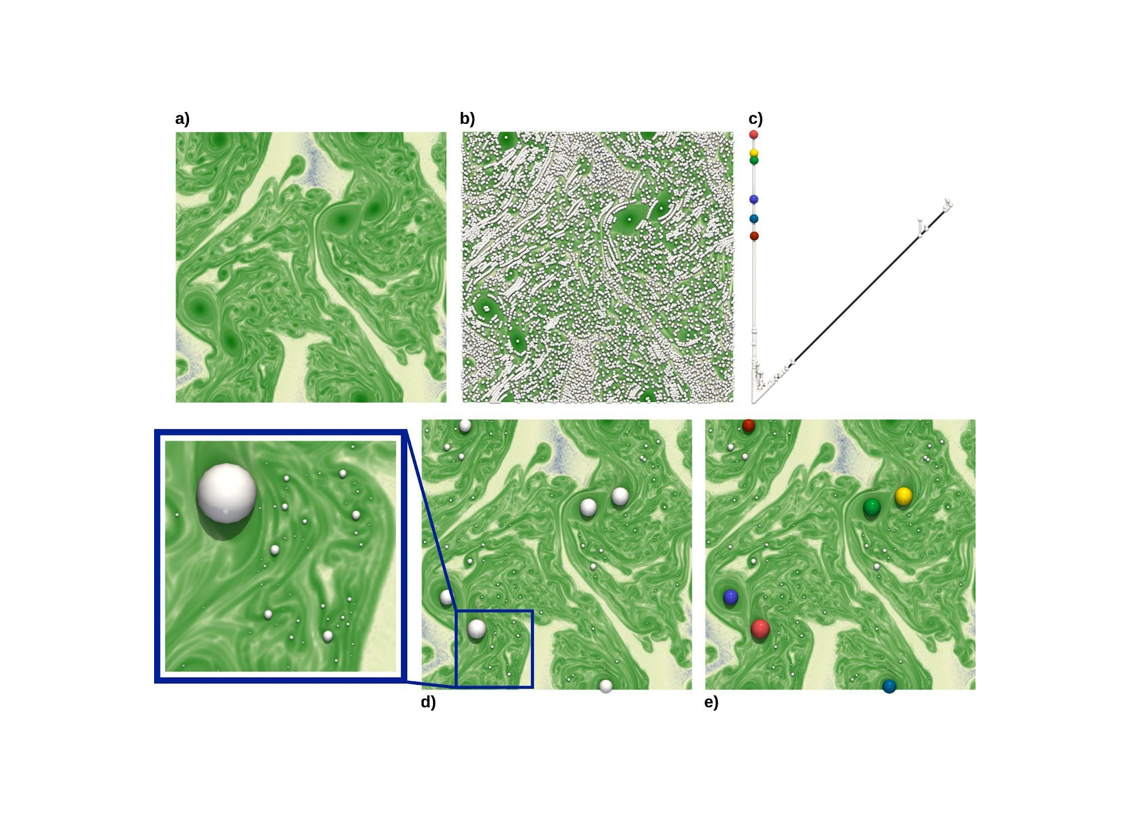
In order to come up with a comparison technique which is faithful to the vortices of the flow, one first needs to come up with a representation of the datasets which nicely captures the structure of the vortices. This can be achieved by computing a topological data representation called the “Persistence Diagram” (in ParaView, select the filter “TTK PersistenceDiagram”). As described in Figure 2, the persistence diagram of the maxima (Figure 2, (c)) nicely captures the center of the vortices and distinguishes the large-scale vortices from the small-scale ones, or even from numerical noise. In general, the persistence diagram is a very popular descriptor in Topological Data Analysis, which concisely captures the main structural features of a dataset.

Figure 2: Topological representation of the vortices in a dataset. The vortices correspond to regions of high Enstrophy in the data (dark green regions, (a)). Specifically, the local maxima of Enstrophy precisely indicate the center of each vortex. However, since the flow is highly turbulent, it exhibits a high number of local maxima (white spheres, (b)), corresponding to vortices of various scales. Topological persistence is a measure of importance defined on critical points which enables to isolate the maxima corresponding to large-scale vortices from the smaller vortices or even from numerical noise (each white sphere is scaled according to the persistence of its maximum, (d)). The persistence diagram (c) provides a concise encoding of the population of critical points (hence of vortices), according to their persistence, i.e. based on their distance to the diagonal (hence to the importance of the corresponding vortex). In figure (c) and (e), the six most persistent maxima of the persistence diagram (i.e. the six spheres the furthest away from the diagonal, black) have been selected (colored spheres, (c)) and visualized back in the data (spheres of matching colors, (e)). These indeed correspond to the strongest vortices of the flow.
Comparing datasets based on their topological signatures
Now that we have a representation of each dataset that enumerates the vortices according to their strength, we can use this representation as a proxy for our analysis. Specifically, as illustrated in Figure 3, we will represent each member of the ensemble by the persistence diagram of its maxima. Then, datasets which have a similar profile of vortices (same number and same strength of vortices) will have similar persistence diagrams. To compare two persistence diagrams, the “Wasserstein distance” from optimal transport can be considered[4]. It is estimated by computing an optimal assignment between the points of the two diagrams (in ParaView, select the filter “TTK PersistenceDiagramClustering”). From a mathematical point of view, this distance has many nice properties, which have a direct impact on the applications. First, it is stable. This means that slight perturbations in the dataset will correspond to only slight distances between their diagrams. Second, it is geodesic and geodesics can be easily computed. This means that it is very easy to continuously morph one diagram A into a diagram B, in a way that minimizes the distance between the morphed diagram and both A and B. This property is actually spectacular for the applications. It means that we can start to derive complex statistical notions, on the abstract space of persistence diagrams, by computing geodesics (i.e. shortest paths) on that space. This is what we do next.

Figure 3: The persistence diagram can now be used as a topological signature of each dataset. Specifically, two datasets which are similar in terms of number and strength of vortices ((a) and (c)) will have persistence diagrams which are highly similar ((b) and (d)). To compare two diagrams, the Wasserstein distance is estimated by computing an optimal assignment (gray lines in (e)) between the points of the two diagrams.
Clustering datasets on the space of persistence diagrams
Since we can now compute distances and geodesics between persistence diagrams, we can move on (step-by-step) towards more complicated statistical notions. For instance, we can now generalize the notion of average to persistence diagrams, with the notion of Wasserstein barycenter of a set (i.e. the diagram which, in short, minimizes its distance to all the diagrams of the set). This is illustrated in Figure 4, where, given a set of diagrams (arranged along a circle), their barycenter provides a sort of representative diagram of the set. This barycenter computation routine can also be integrated in the celebrated k-means algorithm to perform a reliable clustering on the space of persistence diagrams. As discussed in Figure 4, for our case study, with k=2, this clustering (in ParaView, select the filter “TTK PersistenceDiagramClustering”) provides a perfect classification of the ensemble, and automatically distinguishes the 16 Turbulent datasets from the 16 Non-Turbulent datasets. This illustrates that the Wasserstein distance between persistence diagrams is indeed a relevant metric for comparing turbulent flows.

Figure 4: Given a set of persistence diagrams (e.g. the diagram on the circle (a)), one can compute a diagram which is representative of that set (at the center of the circle, (a)) with the notion of Wasserstein barycenter. Then, one can integrate this barycenter computation routine in the celebrated k-means algorithm to reliably perform some clustering directly on the space of persistence diagrams. In the above image, this clustering algorithm (for k=2) isolated a first cluster in (a) and a second cluster in (b). The cluster (a) exactly coincides with the datasets initially marked as “Turbulent” class, while the cluster (b) corresponds to the “Non-turbulent” datasets.
Comparisons
We now compare our strategy based on persistence diagrams to the standard approach, based on the Euclidean distance between the actual datasets. This is illustrated in Figure 5, which shows that the standard Euclidean distance between datasets results in a clustering which fails at distinguishing the Turbulent datasets from the Non-Turbulent datasets. As discussed before, this can be explained by the fact that, for two datasets belonging to the same cluster, the two images are drastically different at a pixel level, given the chaotic nature of the turbulent flow. In contrast, the clustering approach based on the persistence diagrams delivers the perfect classification and manages to distinguish the Turbulent from the Non-Turbulent datasets. Also, the planar layouts generated with this method do a better job at visually separating clusters.

Figure 5: Comparing in ParaView a clustering based on the Euclidean distance (L2, top, three views on the right) to the Wasserstein distance between persistence diagrams (W2, bottom, three views on the right). The L2 distance matrix (top, center) encodes in each entry (i,j) the Euclidean distance between the datasets i and j. This distance matrix is used to generate planar views of the ensemble (top, the two right most views) via multidimensional scaling (MDS). This means that in the planar views, each sphere represents a dataset, and the 2D distance between any pair of spheres coincides (as much as possible) to the distance provided in the distance matrix (top center). A k-means clustering in 2D separates the ensemble into two clusters (top, L2 - kMeans, in green and blue) which do not coincide with the ground truth classification (top, Ground-truth: the spheres in green correspond to Turbulent datasets, while the spheres in blue correspond to Non-Turbulent datasets). In contrast, the same analysis applied on the distance matrix generated by the Wasserstein distance with the persistence diagrams (bottom, center) delivers the perfect classification automatically, while nicely separating the clusters in the 2D planar view (bottom right).
Interactive exploration
Furthermore, as showcased in the above video, this pipeline enables an interactive exploration of the ensemble. Specifically, users can select in the planar view any sphere and update the dataset view, to visualize the corresponding dataset. This is achieved thanks to the capabilities of TTK’s implementation of the cinema database model. Specifically, the input ensemble is modeled as an SQL database which can be interactively queried for exploration purposes. In this example this enables the side-by-side comparisons of datasets which are interpreted as close by the planar layout.
Further readings
The implementation of the Topology ToolKit has been documented in the following papers:
- The Topology ToolKit – Julien Tierny, Guillaume Favelier, Joshua A. Levine, Charles Gueunet, Michael Michaux – IEEE Transactions on Visualization and Computer Graphics (Proc. of IEEE VIS 2017) – Best paper honorable mention award.
- An Overview of the Topology ToolKit – T. Bin Masood, J. Budin, M. Falk, G. Favelier, C. Garth, C. Gueunet, P. Guillou, L. Hofmann, P. Hristov, A. Kamakshidasan, C. Kappe, P. Klacansky, P. Laurin, J. Levine, J. Lukasczyk, D. Sakurai, M. Soler, P. Steneteg, J. Tierny, W. Usher, J. Vidal, M. Wozniak. – TopoInVis 2019.
TTK’s latest backend for persistence diagram computation has been documented in this paper:
- Discrete Morse Sandwich: Fast Computation of Persistence Diagrams for Scalar Data — An Algorithm and A Benchmark – Pierre Guillou, Jules Vidal, Julien Tierny – IEEE Transactions on Visualization and Computer Graphics (to be presented at IEEE VIS 2023).
TTK’s algorithm for optimizing a barycenter of a set of persistence diagrams is described here:
- Progressive Wasserstein Barycenters of Persistence Diagrams – Jules Vidal, Joseph Budin, Julien Tierny – IEEE Transactions on Visualization and Computer Graphics (Proc. of IEEE VIS 2019) – Best paper honorable mention award.
The study discussed in this blog post is taken from the TTK Online Example Database. This experiment was originally presented in the publication below, which includes many more advanced analyses (in particular, advanced experiments show the ability of persistence diagrams to distinguish different solver types, i.e. Flux Difference Splitting VS Flux Vector Splitting):
- Topological Analysis of Ensembles of Hydrodynamic Turbulent Flows — An Experimental Study – Florent Nauleau, Fabien Vivodtzev, Thibault Bridel-Bertomeu, Heloise Beaugendre, Julien Tierny – IEEE Symposium on Large Data Analysis and Visualization (LDAV), 2022
This blog post discussed the possibility of running basic statistical tasks directly on the metric space of persistence diagrams, specifically barycenter computation. More advanced statistical notions have recently been explored, for example with the notion of Principal Geodesic Analysis of Persistence diagrams, which extends to the metric space of persistence diagrams the celebrated Principal Component Analysis framework:
- Principal Geodesic Analysis of Merge Trees (and Persistence Diagrams), Mathieu Pont, Jules Vidal, Julien Tierny — IEEE Transactions on Visualization and Computer Graphics (to be presented at IEEE VIS 2023).
Acknowledgements
This work is partially supported by the European Commission grant ERC-2019-COG “TORI” (ref. 863464) and the CEA/CESTA.