VTK-PyData Interoperability: Interactive Climate Analytics with Pan3D, Xarray, and xCDAT
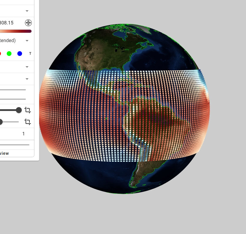
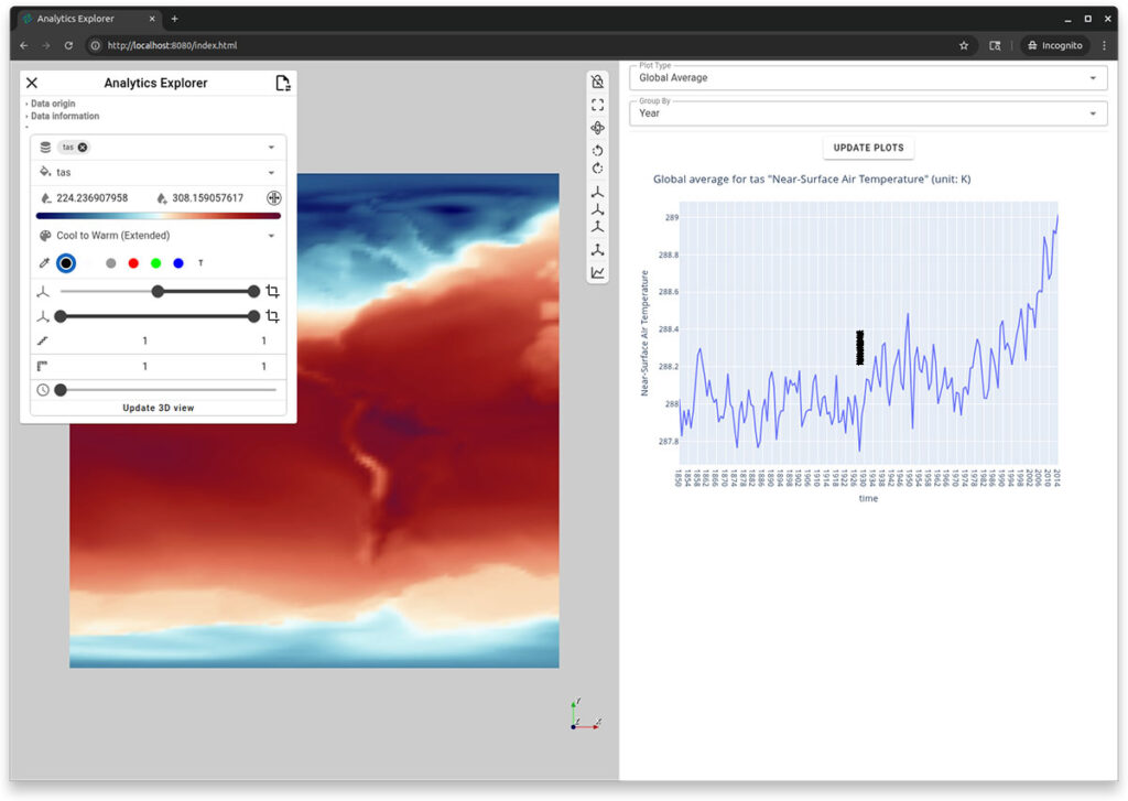
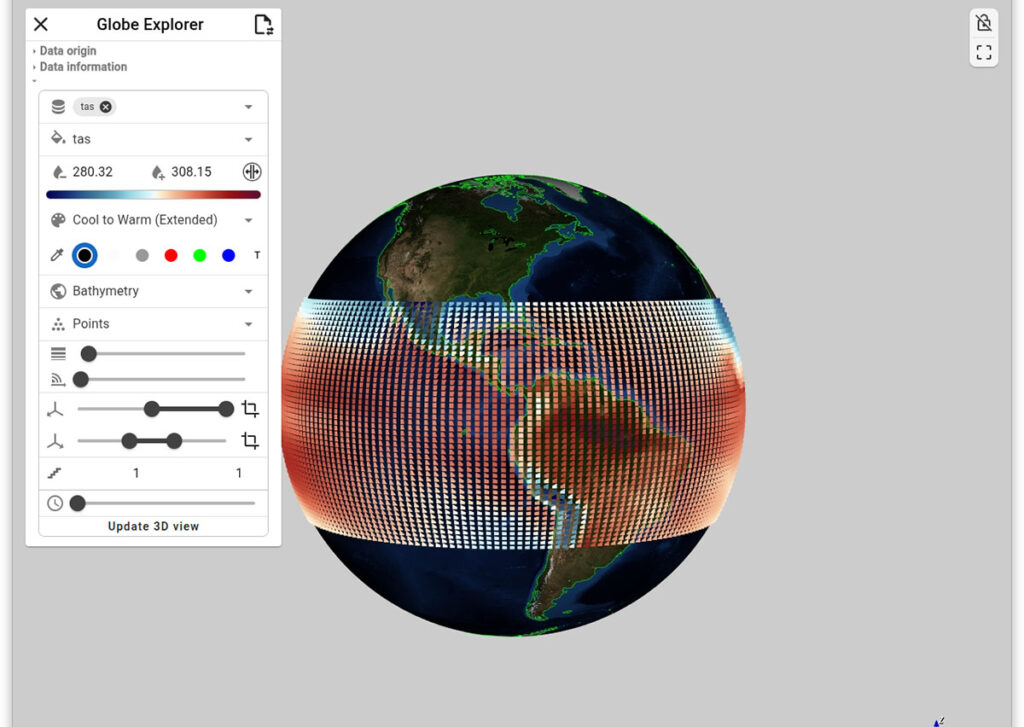
Figure 1. The Analytics Explorer (top) shows a 3D visualization and a linked plot of the global average near-surface air temperature from 1850 to 2024. The plot updates interactively based on spatial selection (e.g., North and South America) and temporal filters. The Globe Explorer (bottom) presents the same data on a globe with additional latitudinal filtering for the torrid zone.
When Visualization Meets Data Science
Scientific researchers working with multi-dimensional datasets face a fundamental integration challenge: the powerful visualization capabilities of VTK and the rich data analysis ecosystem of PyData (NumPy, Xarray, pandas) have traditionally existed in separate silos.
While VTK’s existing NumPy integration provides basic array interoperability, much more work is needed to bridge the gap with higher-level PyData tools. Instead of focusing on discovery, researchers spend countless hours bridging these worlds—writing custom adapters, managing data format conversions, and maintaining fragile integration code. A typical workflow might involve loading datasets with Xarray, processing them with NumPy, then manually converting data structures to feed VTK pipelines for 3D visualization, all while losing the interactive, exploratory nature that makes PyData tools so powerful—including the rich metadata, coordinate systems, and lazy loading capabilities that get lost in translation to VTK.
This disconnect forces an uncomfortable choice: either sacrifice VTK’s advanced 3D rendering capabilities for PyData’s seamless interactivity, or abandon the rich PyData ecosystem for VTK’s visualization power. Meanwhile, the promise of interactive data science—where exploration, analysis, and visualization flow together naturally—remains unrealized.
What the scientific computing community needs is deeper VTK-PyData interoperability: a framework that enables researchers to build complete interactive workflows in pure Python, leveraging the full power of both ecosystems without sacrificing the strengths of either.
That’s where Pan3D comes in—building on VTK’s NumPy foundation to create unified architecture that makes Xarray datasets and VTK pipelines work together seamlessly, enabling researchers to build sophisticated interactive applications without leaving Python.
Pan3D: Pythonic Workflows using VTK, trame, Xarray, XCDAT for Discovery
Pan3D removes these barriers by offering Python-based workflows designed for interactive data exploration. Instead of replacing existing tools, it builds upon the Python scientific ecosystem—particularly Xarray for data handling and VTK + trame for visualization—while delivering the missing piece: seamless integration and interactive web-based exploration.
Before we dig into more details, lets try to first install Pan3D via conda:
conda create --name pan3d python=3.13 ipython
conda activate pan3d
conda install -c conda-forge pan3d
Now you have Pan3D installed, let’s understand the core objective of it which is to minimize time spent on data wrangling and scripting, so users can focus on insights and discovery. Pan3D was developed with four guiding principles in mind: interoperability, integration, interactivity, and reproducibility.
At its core, Pan3D uses a custom reader built on VTK’s VTKPythonAlgorithm, which brings two major advantages:
- It allows users to define flexible 3D visualization pipelines using VTK.
- It supports seamless data exchange between VTK and array-based libraries like NumPy, Zarr, Xarray, and Dask.
The following code provided supporting evidence to these statements
import xarray as xr
import numpy as np
from pan3d.xarray.algorithm import vtkXArrayRectilinearSource

# Load a sample Xarray dataset (from xarray's built-in tutorial datasets)
# This dataset includes u, v, and z components on a 3D rectilinear grid
xrdata = xr.tutorial.open_dataset("eraint_uvz")

# Create a VTK reader that can consume Xarray datasets as input
# This reader converts the rectilinear grid into a VTK pipeline-compatible source
source = vtkXArrayRectilinearSource(input=xrdata)

# Declare which arrays to expose to the pipeline (e.g., velocity fields)
source.arrays = source.available_arrays

# Execute the reader and fetch a specific variable ('u') from point data
# The result is a VTKArray: a NumPy-compatible wrapper around a VTK data array
var_u = source().point_data['u']

# This confirms that the variable is accessible as a VTKArray,
# which behaves like a NumPy array but retains a zero-copy link to VTK memory
print(type(var_u))
"""
> <class 'vtkmodules.numpy_interface.dataset_adapter.VTKArray'>
"""

# This allows you to perform NumPy operations directly:
# e.g., np.mean(var_u), var_u[::10], or even vector math like np.linalg.norm(var_u, axis=1)
This design ensures interoperability with the broader Python data ecosystem, while integrating easily into existing scientific workflows. Although Pan3D currently includes native support only for Xarray, integrating additional libraries requires minimal effort.
For additional information about the latest python based innovations in VTK, please refer to the following links.
- https://www.kitware.com/bridging-data-and-visualization-interactive-scientific-exploration-with-vtk-xarray-interoperability/
- https://www.kitware.com/vtk-and-numpy-a-new-take/
- https://www.kitware.com/vtk-9-4-a-step-closer-to-the-ways-of-python/
For large geophysical datasets, Pan3D leverages Xarray’s lazy loading and efficient slicing to offload the burden of data handling—ensuring responsive performance when generating VTK-ready data structures.
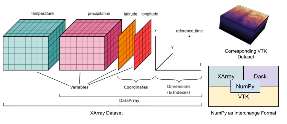
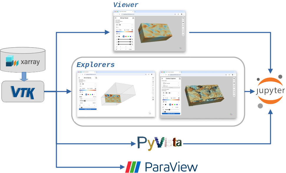
Figure 2 presents a block diagram showing how Pan3D manages multi-dimensional Xarray datasets and makes them accessible through VTK. While Pan3D currently provides built-in support for Xarray, integration with other libraries can be achieved with minimal effort.
For large geo-physical datasets, the Pan3D reader relies on Xarray’s capabilities for lazy loading and efficient slicing. This offloads the data management burden and enables Pan3D to deliver responsive performance when preparing VTK datasets for visualization.
Explorers
Another key component of Pan3D is its modular, web-based 3D visualization system built using trame. This system powers a suite of focused tools called Explorers, designed to be modular, reusable, and easily extended.
Each Explorer is built around a specific task—think of them as “one-trick ponies” with clean interfaces tailored to their purpose. This avoids the clutter and complexity of general-purpose tools.
Because trame supports integration with Jupyter notebooks, Explorers can also be used interactively within code-assisted environments—enabling reproducible workflows and intuitive visual analysis.
Pan3D currently includes four Explorer tools:
- Slice Explorer – for spatial slicing across user-defined dimensions
- Globe Explorer – for projecting 2D/3D data onto the Earth’s surface
- Contour Explorer – for rendering contour lines across datasets
- Analytics Explorer – the newest addition, combining xCDAT-powered statistical analysis with 3D visualization
In the next section we introduce the Analytics Explorer in more detail.
For additional information on trame or Pan3D, please refer to the following links:
- https://www.kitware.com/simplify-web-application-development-with-trame/
- https://www.kitware.com/kitware-introduces-pan3d-a-collaborative-interoperable-visualization-tool/
- https://www.kitware.com/trame-in-jupyterlab-a-unified-approach-for-web-apps-in-scientific-computing/
Analytics Explorer
To support climate science workflows such as generating domain-specific statistical plots, Pan3D introduces the Analytics Explorer, powered by xCDAT—an extension of Xarray tailored for structured climate data.
The Explorer supports interactive plotting of spatial, temporal, and global averages, allowing users to specify regions of interest via latitude and longitude. By integrating trame-plotly, it delivers responsive, browser-based plots without the need for custom code.
To use the analytics explorer, users will need to install Pan3D using a conda environment.
conda activate pan3d
xr-analytics
The analytics explorer resembles the default viewer from pan3D, except for one key detail – the analytics panel. The panel is hidden by default – and can be expanded by using the button located in the toolbar to the top right of the panel – shown in the figure below.

The control panel allows users to select the quantity of interest, configure scalar mappings, and adjust spatial and temporal settings. It also offers controls for level of detail and spatial scaling. The analytics panel allows control over the type of information that is being plotted. Users simply interact with the elements in the analytics panel to select the plot type and configure spatial or temporal filters—making complex climate analysis intuitive and repeatable. Figures 4 and 5 show the Analytics Explorer in action. Users can select the type of plot using the “Plot Type” dropdown and explore different data dimensions through the interactive panels.
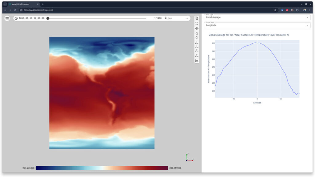
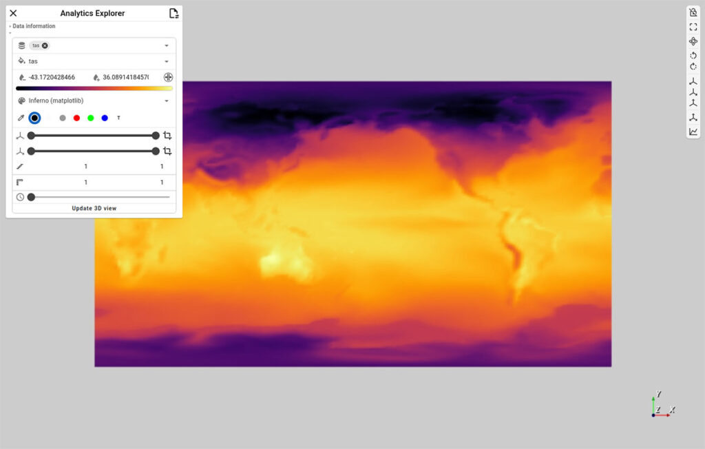
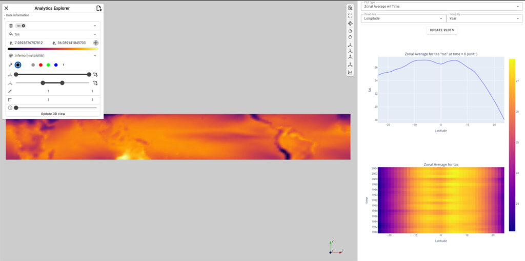
Figure 5. The Analytics Explorer – the top presents the dataset in its entirety, while the bottom demonstrates the selection and plotting capabilities of the explorer. At the bottom, the latitude range has been selected to focus on the torrid zone, and the plots are updated to reflect the selection. When selected “Zonal Average w/ Time,” the analytics explorer displays a stacked plot w/ the zonal average for the current time slice, and a heat map of the Zonal average over the entire temporal range.
The accompanying video shows the Pan3D analytics explorer in action.
The Analytics Explorer can also run inside Jupyter notebooks, enabling hybrid workflows that combine code-based preprocessing with interactive visualization. For example, users can preprocess datasets (e.g., convert temperature from Kelvin to Celsius) directly in Python, then launch the Explorer with updated values—all in the same environment. The following kernels can be helpful in readily trying this in your environment, given all pre-requisites are satisfied.
To try these kernels, make sure to install additional dependencies in the conda environment.
conda activate pan3d
# install the jupyter lab dependency
conda install -c conda-forge jupyterlab
# navigate to the notebook examples in the pan3D repo,
# https://github.com/Kitware/pan3d.git
# launch the notebook titled xarray-analytics.ipynb
cd examples/jupyter
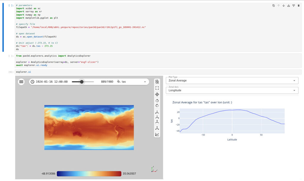
jupyter-labThe xarray-analytics notebook contains the following code blocks. The example data sets are public and available at the xCDAT data repository. If using from the pan3D repository, the data is present already in the examples/data directory.
# import the necessary packages, we only need xcdat to open local data file
import xcdat as xc

# specify local data file
# The example xcdat datasets can be downloaded from
# https://github.com/xCDAT/xcdat-data
filepath = "../data/tas_Amon_ACCESS-ESM1-5_historical_r10i1p1f1_gn_185001-201412.nc"

# open dataset
ds = xc.open_dataset(filepath)

# Unit adjust (-273.15, K to C)
ds["tas"] = ds.tas - 273.15
Kernel 1. Setup xcdat data and manipulate fields for target analysis – in this case changing the unit for temperature from Kelvin to Celcius
# Import the installed pan3d explorer
from pan3d.explorers.analytics import AnalyticsExplorer

# Instantiate the explorer and wait until it finishes setting up
explorer = AnalyticsExplorer(xarray=ds, server="esgf-slicer")
await explorer.ui.ready

# Launch the interactive explorer within jypyter notebook
explorer.ui
Kernel 2. Set up pan3D analytics explorer to visualize data interactively from Jupyter notebook
Figure 6 shows a screenshot of these kernels in action.
Final Thoughts
The Pan3D project represents a significant leap forward in how geophysical researchers analyze and visualize multi-dimensional data. By fusing the strengths of the Python data stack with interactive, web-based visualization, it removes traditional barriers between exploration, analysis, and collaboration.
Whether you’re studying climate trends, ocean circulation, or atmospheric models, Pan3D’s modular Explorer system adapts to your workflow—without requiring you to abandon trusted tools.
Interested in integrating Pan3D into your research pipeline or building custom visual workflows? Kitware’s team can help you move faster, with deep expertise in VTK, Xarray, trame, and geophysical data challenges.